HackBAC
Creating a standalone registration site to clearly communicate and highlight the identity and mission of HackBAC.
Client
St. Andrews Episcopal School
Services
UI & UX Design
Industries
Ecommerce
Duration
2.5 weeks
Overview
HackBAC is a social justice hackathon created to empower BIPOC students in grades 8–12 to develop design solutions addressing systemic inequality.
In collaboration with 3 other UX designers, we redesigned HackBAC’s fragmented web presence into a standalone Squarespace site that streamlined registration, showcased past student work, and clearly communicated the program’s mission and credibility to educators, parents, and students.
Through site audits, stakeholder interviews, affinity mapping, personas, task flows, wireframing, and usability testing, we identified key user frustrations around confusing navigation and lack of clear information. The final solution focused on intuitive navigation, stronger visual storytelling, and a simplified registration experience that helped establish trust and improve accessibility for prospective participants.
The Process
The client provided a substantial amount of assets and information, ranging from business proposals and past event materials to visual branding assets.
To begin, we organized and analyzed all provided resources to gain a clear understanding of HackBAC’s identity an the unique value it offers to users

HackBAC’s existing web presence was fragmented across multiple pages under a larger organization’s site, making it difficult for users (mainly DEI coordinators and school decision-makers) to quickly understand what HackBAC is, how to register, or why the program is credible.
While a prototype for a standalone site had been created in the past, it remained unpublished and outdated, requiring revisions to reflect current goals and content needs.
Research
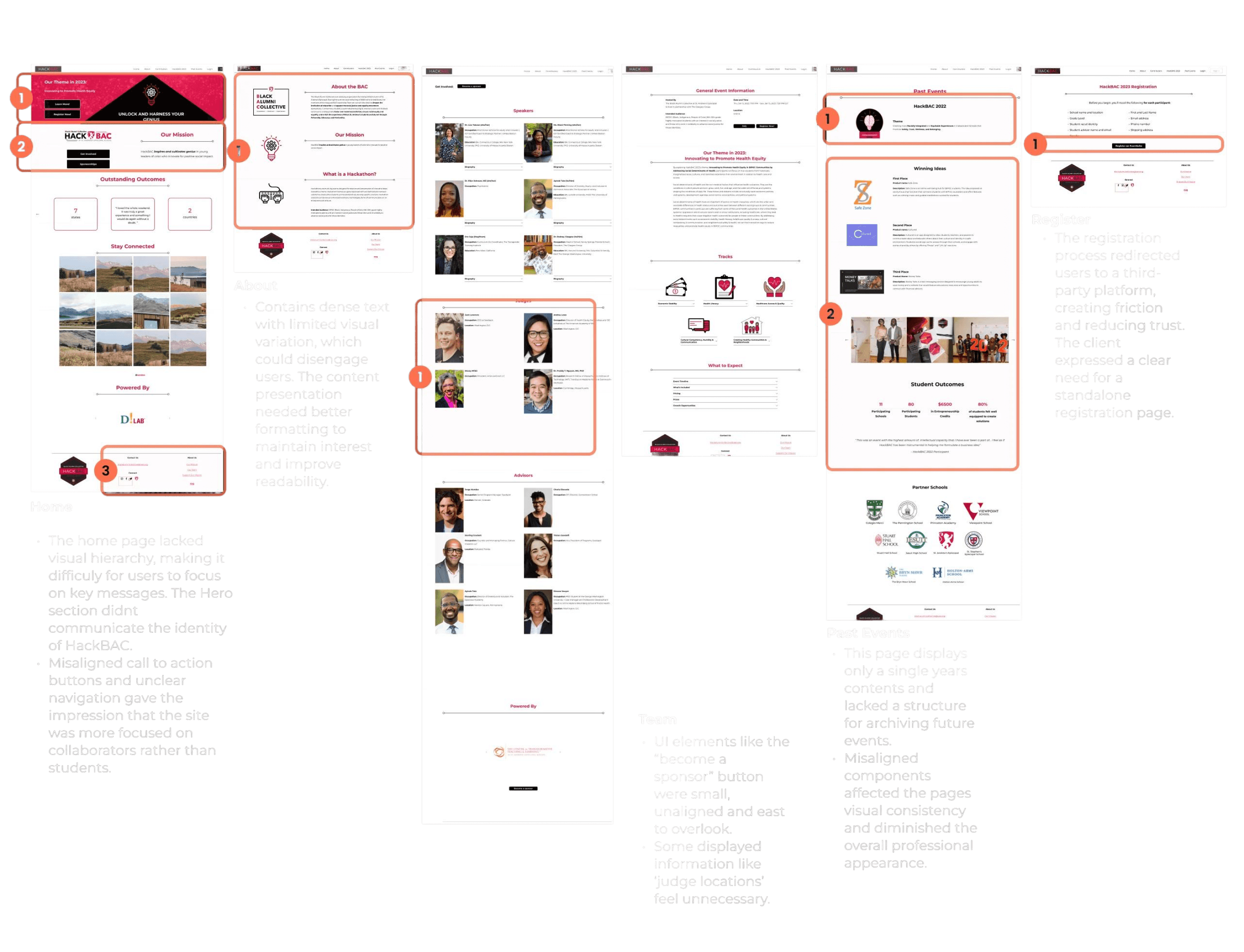
With that foundation, we began our research by conducting a site audit of the existing web presence. This allowed us to assess the current content, structure, and user touchpoints, helping us identify how HackBAC was (or wasn't) communicating its mission offerings, and credibility through its digital presence.
One of the key constraints in this project was the requirement to build the final website using Squarespace, a platform our team had no prior experience with. This added a layer of complexity, as we had to quickly familiarize ourselves with its capabilities while also working within its limitations in layout flexibility, fixed components, and restricted customization options.
Additionally, there were delays in receiving contact information for potential user interview participants from the client. Given our tight 3 week project timeline, we used this waiting period to study Squarespace’s features and limitations in-depth and began structuring the website framework early, ensuring we could move forward without losing momentum
Once we received contact information for key stakeholders,
we conducted interviews to better understand how users
discover programs like HackBAC, what information the
prioritize, and the challenges they face during decision
making and registration

To identify shared patterns across different stakeholders and surface the most pressing issues, we organized the findings from interviews into an affinity map. Clustering quotes and observations allowed us to clearly define user needs, highlight common pain points, and uncover actionable design opportunities that informed the next phase of our process.
Synthesis
Through our research, we identified key insights that revealed shared frustrations among stakeholders, including hard-to-navigate websites, a lack of past program results or testimonials, and limited time or patience to sift through disorganized content
These findings led to several clear design opportunities: prominently showcasing HackBAC’s mission and past success stories, surfacing essential logistics early (such as event details, cost, and eligibility), improving the registration experience with a clear call-to-action and integrated form, and using visual storytelling, through photos, testimonials, and student projects, to quickly establish trust and generate interest.

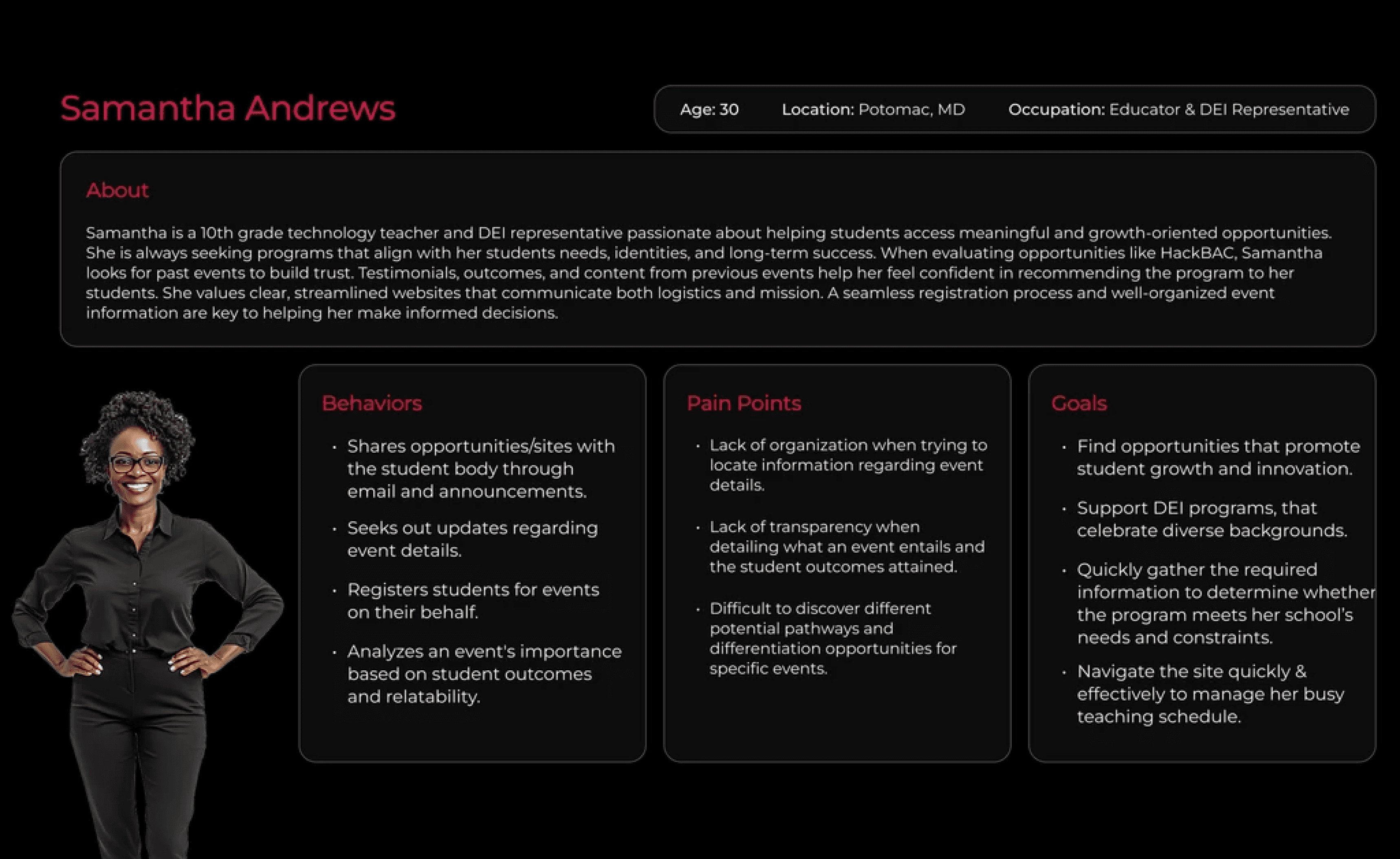
Based on our research, we developed two key personas: Samantha, a DEI coordinator who wants to provide meaningful experiences for her students but needs clear, credible information before recommending programs; and Andrew, a curious and motivated high school student who seeks engaging opportunities but often struggles to find or access the right information.

After, we created a task flow that reflects how the targeted user (DEI coordinator) might navigate the site from first landing to the registration page.
The journey begins on the Home Page, where users are introduced to HackBAC’s mission and value. From there, they explore the upcoming event details, building trust through team bios and past event highlights, and ultimately proceed to register their students. The site’s information architecture was intentionally designed to guide users through this flow intuitively while reinforcing credibility at each step.

Ideation
With our task flow and design opportunities defined, we created wireframes that prioritized both user needs and the technical constraints of Squarespace. The layouts were intentionally kept simple and modular to ensure they could be implemented smoothly within the platform’s limited customization options.

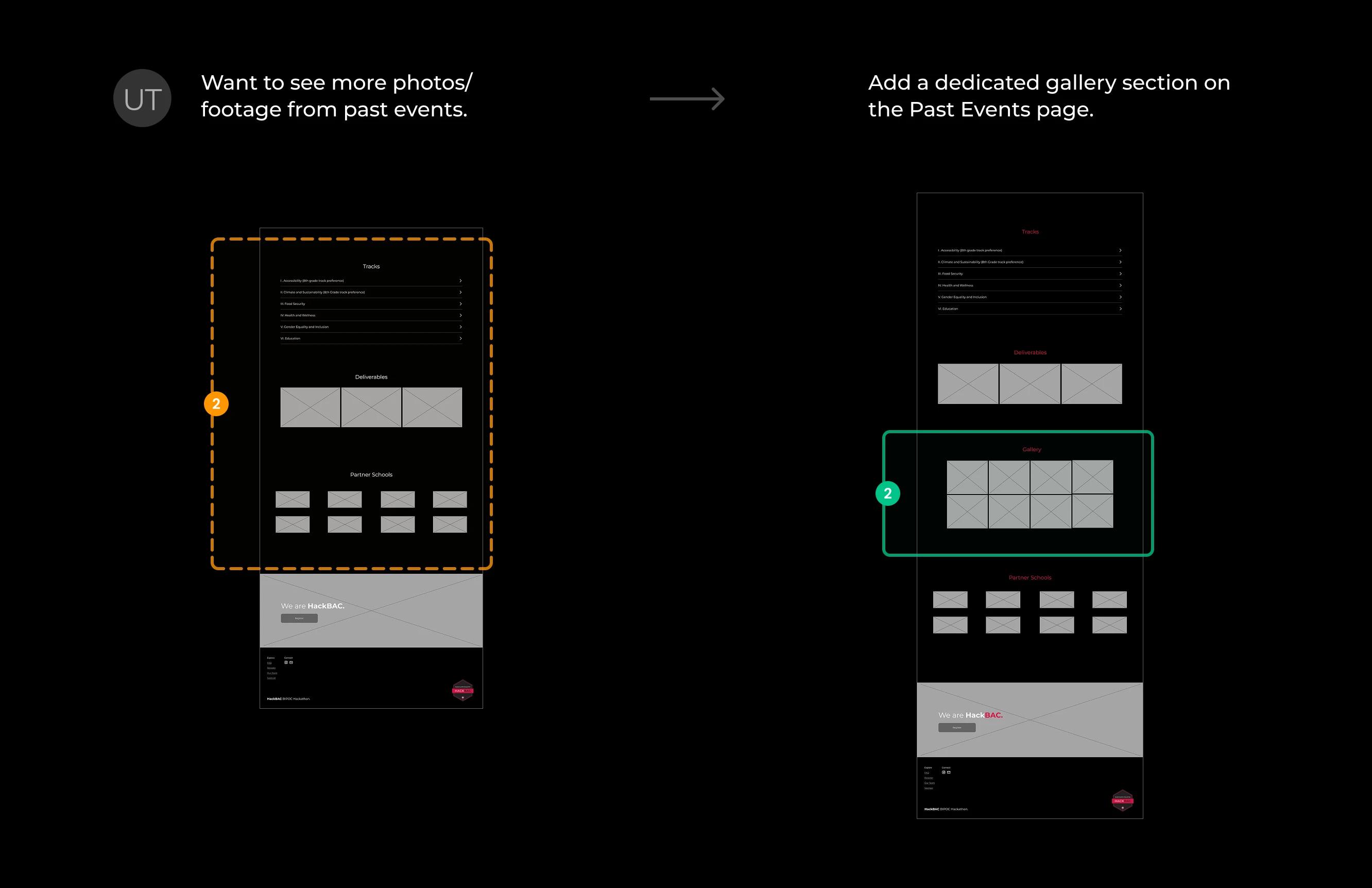
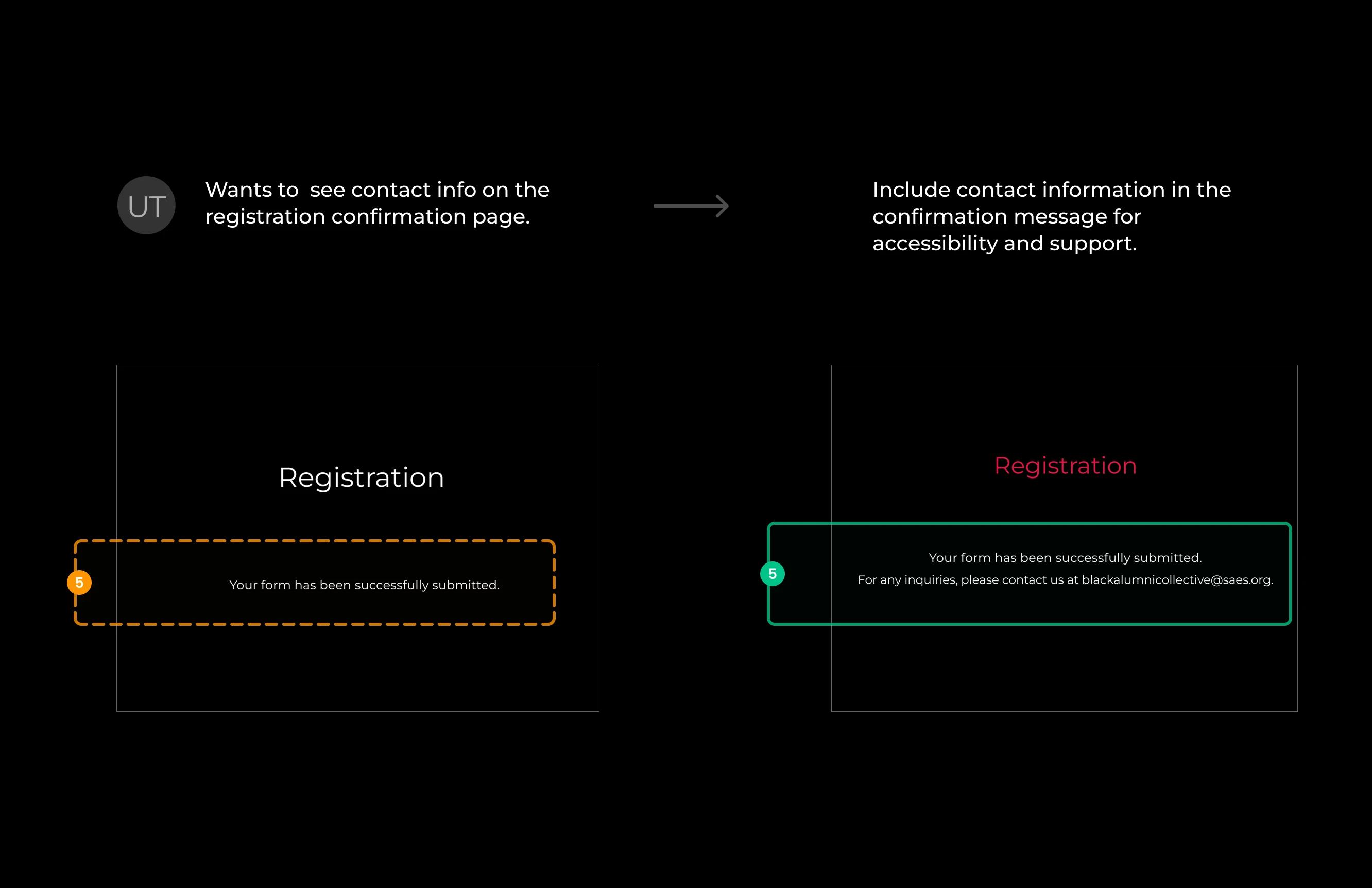
The wireframes underwent several rounds of usability testing with potential users, who were asked to explore the site, assess its credibility, and complete the registration flow.
Overall, participants found the navigation intuitive and the structure easy to follow. Most feedback focused on improving the accessibility and visibility of specific content, which directly informed key revisions in our final design.


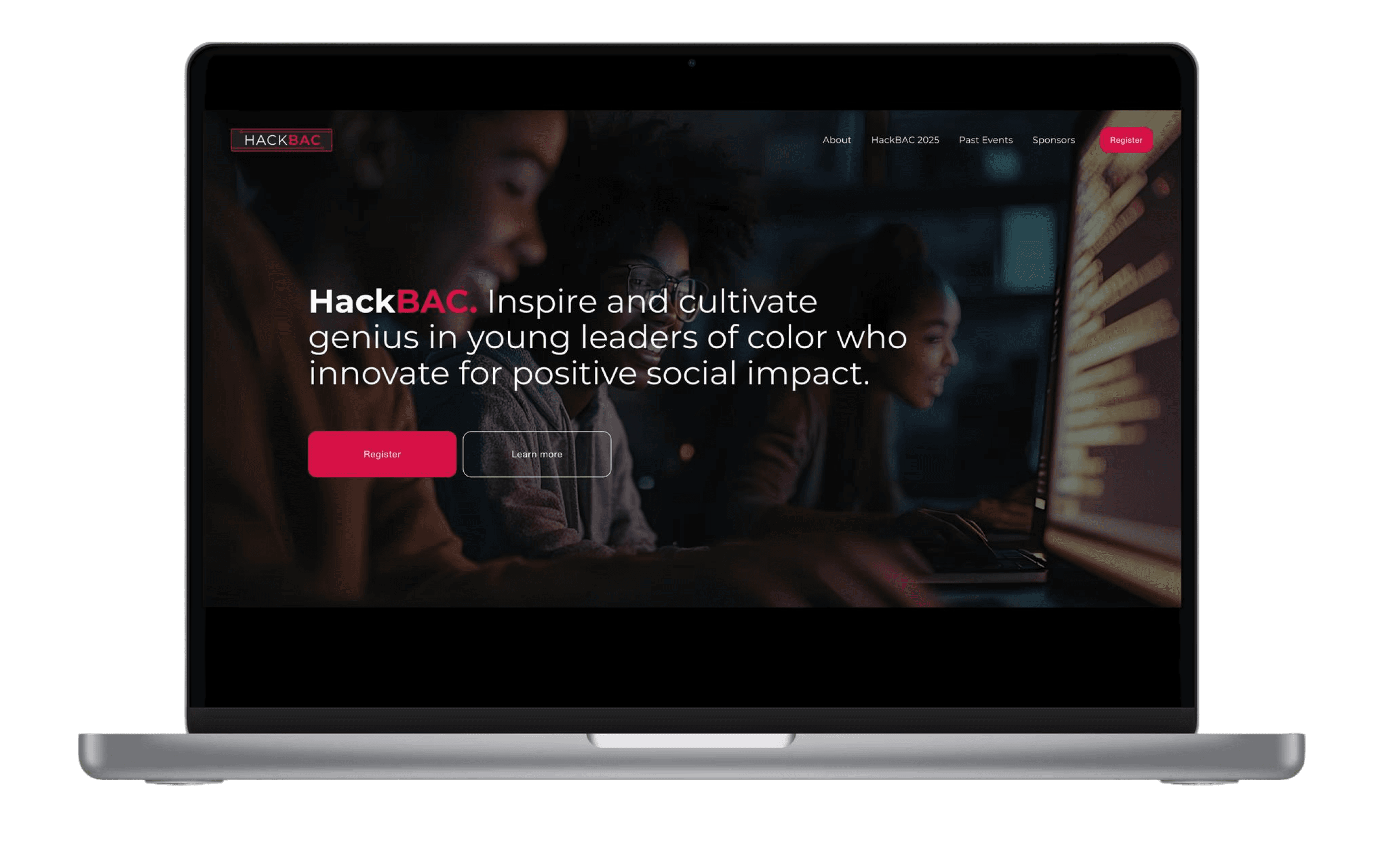
This leads us to our final site!
Link: https://www.hackbac.org
Learnings
This project taught me how to balance user needs with platform constraints, communicate value through visual storytelling, and collaborate closely within a design team. It also deepened my understanding of how credibility is built through structure, tone, and content.