Phoenixville Library
Creating an app to brings a local libraries secret resources to the public eye.
Client
Phoenixville Library
Services
UI & UX Design
Industries
Library and information services
Duration
2 week sprint

Overview
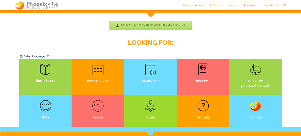
The Phoenixville Library is more than books, it offers a wide range of rentable items, from musical instruments to medical equipment. Most don't know that the opportunity to rent these out even exists.
During a two-week sprint, I collaborated with three other UX designers. We conducted user interviews, competitive analysis, affinity mapping, and usability testing to better understand the frustrations library users faced with the current system.
Our research revealed major pain points around navigation, item visibility, availability tracking, and the inability to reserve items online. In response, we designed a mobile app experience that made browsing and borrowing easier through categorized listings, real time availability updates, reservation alerts, digital library card access, access to setup guides, and integrated late fee payments.
The project emphasized research driven design, and creating a more accessible and community focused library experience.
Research
The current site of the library makes it hard for users to even get to the page to see these items. But even if they can get there it feels very clunky and out of date. Items are left uncategorized with no way to see if the items are even available to rent out. But most importantly there’s no way to reserve these items online.
Two of our team members started a competitive/comparative analysis, while I conducted a series of user interviews both in-person and online. For my in-person interviews, I took a trip down to the Phoenixville library itself to talk with its real users.
When I visited the Library and asked an employee for permission to interview patrons, I was redirected several times until I was led to the libraries director’s office. Once there, I provided a detailed explanation of my project and its purpose. After addressing her concerns, she approved the interviews, and I was set loose on the population of the library
Synthesis
In total we got 8 interviews, 4 from library employees and 4 from library users.
After transcribing, and organizing all the statements into an Affinity map.
The insights gathered from these interviews showed that users wanted:
An easily accessible and categorized list of items in a feed
The ability to see availability at a glance
Alerts for when unavailable items are returned back to the library.
A way to quickly access their library card.
Guides on how to use the rented products if setup is needed
The ability to pay for any late fees

As a group we discussed how these could form our insights into a new persona so we could get a better understanding of who exactly we were making this for. With a lot of back and forth debate and plenty of time staring at our created "I" statements to see the connections, we created:
Alex Rivera
Age: 32
Occupation: Freelance Designer
Background:
Alex loves the library as a vibrant community hub and visits often to work, attend events, and explore resources. However, navigating what’s available can be difficult, especially if she doesn’t know the exact name of a resource. Passionate about lifelong learning, she frequently checks out books on design and entrepreneurship but is most excited by non-book items like cameras, graphic tablets, and 3D printers. Poor website navigation and limited promotion often lead her to miss out on valuable resources.

Needs
Easier Discovery: Find and rent non-book resources faster.
Better Navigation: No need to know exact names.
Clear Availability: See real-time updates on item wait times and availability.
Community Connection: Meet like-minded people through events.
Frustrations
Hard to Find Resources: Tough to explore without exact names or titles.
Confusing Navigation: Hard to browse and find resources
Low Visibility: Library services, events, and rental options aren’t well-promoted.
Messy Search: Lacks useful filters, making it hard to find the right resource.
Goals
Effortless Discovery: Find and access library resources and events that align with her interests
Better Resource Promotion: Stay informed about new tools, events, and services.
Clear Navigation: Filters that make renting non-book items frictionless.
Seamless Experience: A system that works for her, not against her.
Using Alex we came together to create a problem statement that best incorporated her entire being:
“Alex, an active library user, faces challenges in easily discovering and accessing the library's resources beyond books. Because of poor website navigation, limited promotions, and unpredictable wait times, it makes it difficult for her to fully utilize the library’s offerings, hindering her ability to engage with the community and advance her learning.."
Based on how the site functioned it made sense to us that the flow should be similar to an eccomerce website. We created a user flow to help us understand exactly how the user would get from beginning to end.
So it was pretty smooth creating Alex's user flow from there.

To continue the momentum as a team we wanted to go through a MSCW using a feature inventory supplemented from the duo that took on our comp analysis' and what we learned from the people of the world.

After we had an idea of what we needed, we created a sitemap to help us with our designs and get an understanding of how the whole site would be appropriately mapped out. Which because it was similar to an ecommerce site, we went with a pretty straight forward pattern of what you'd see on one.

Ideation
We each made our sketches, came together and went through each persons sketch idea and debated amongst ourselves for the style that made the most makes sense for Alex's flow.

Once we came to an agreement on how we saw the overall site, we decided the best way for us to get the most done with the time we had, was to divide up the pages and create the wireframes for our page.

Addressing the user needs.
We sorted the Library’s offerings into four main navigation blocks and made it accessible at the main page.
Categorized Library of things by theme & similarities.
Ensured users can identify item availability before proceeding to borrow.
Allowed users to set an alert for unavailable items they’re interested in, notifying them when they become available.

Allowed the library card to be accessible through the app, making it easily accessible when they rent / return items.
Provided an item usage guide / link to the official product guide website.
Allowed late fees payable through app, make it visible to give user a sense of responsibility to return items on time.

User testing
Using these initial wireframes, we conducted five usability tests, asking participants to: find and borrow a “Light tracing box” using the app.
We then identified some shared comments and areas of confusion that needed improvement
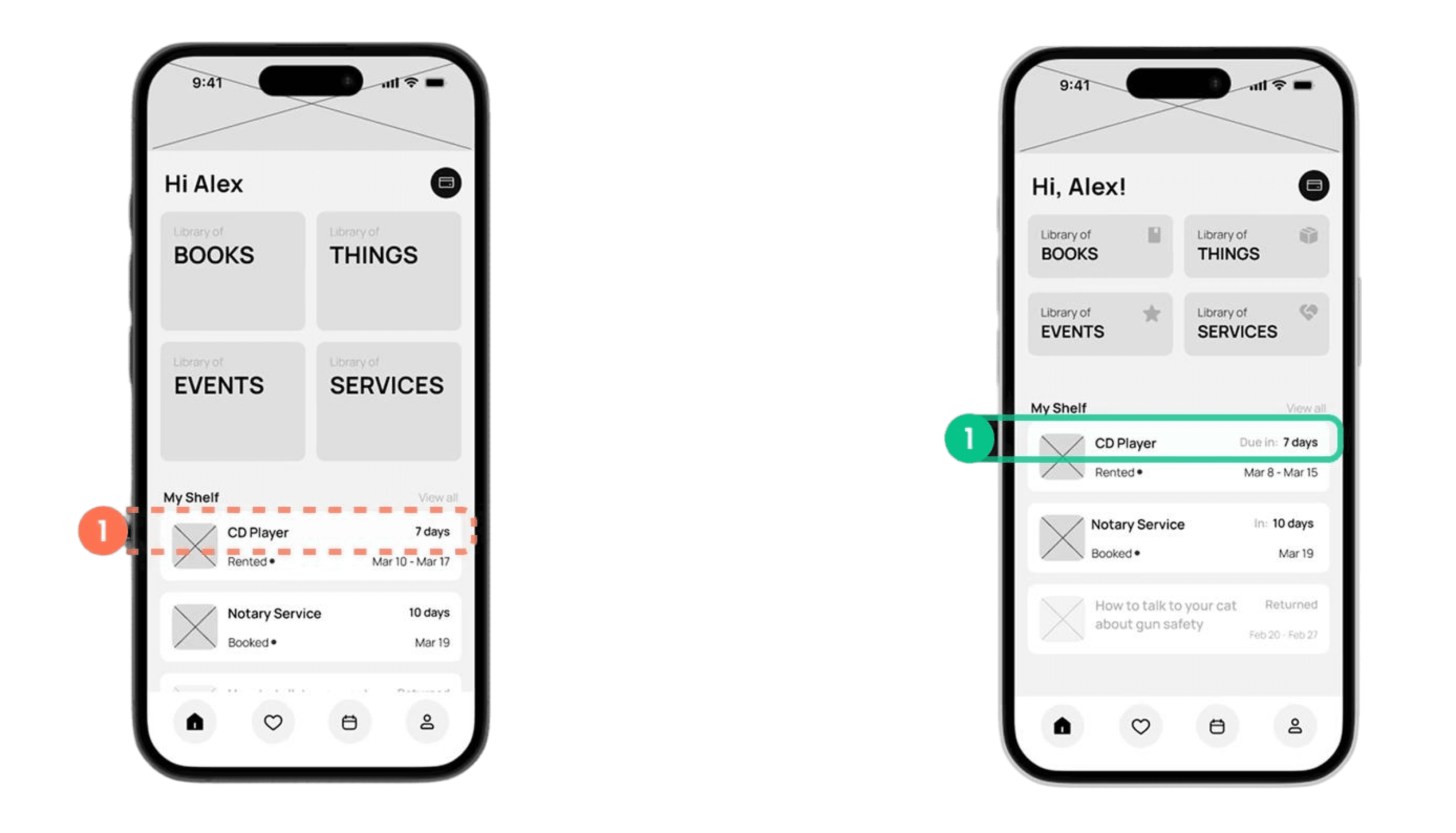
First, on the Home Page, users were confused about the “days” displayed in the right corner of “Recently borrowed Item section.”
It was meant to indicate the days left until return, but it wasn’t clear.
So to improve clarity, we added contextual guidance, changing it to “Due in # days.”
Next, on our PDP -
Users misunderstood the status of availability, due to the light grey colored text.
Also, users didn’t notice that “1 week” refers to available rental duration.
To resolve this, we darkened the text for better readability, and clarified that the item is available for a 1-week “rental” period.

Another issue on our PDP was that users struggled to find the “Borrow” button since it required scrolling down to access.
To fix this, we adjusted the layout, allowing the button to be visible without scrolling.

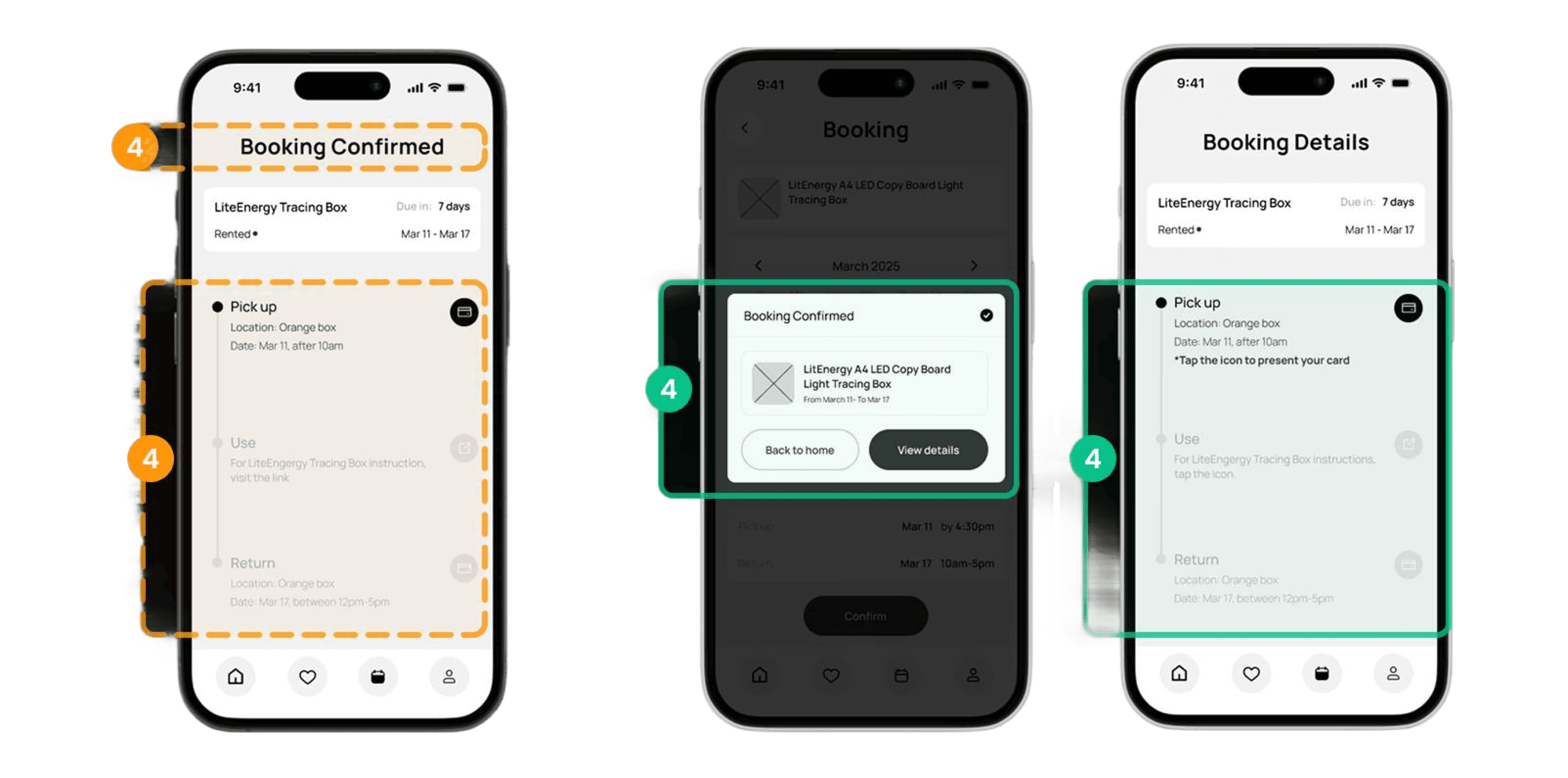
Here is the most common issue we found, confusion regarding our Booking Confirmation page.
After clicking the “Borrow” button on the PDP, users are directed to this ‘Booking Confirmation page’ which includes next-step instructions.
Our participants thought this page was only accessible once, which isn’t our intention since users need to access it again and again when they pick up, use, or return items.
So we separated the “Booking Confirmation” page from a newly created “booking details” page, making the information accessible at any time to solve this.
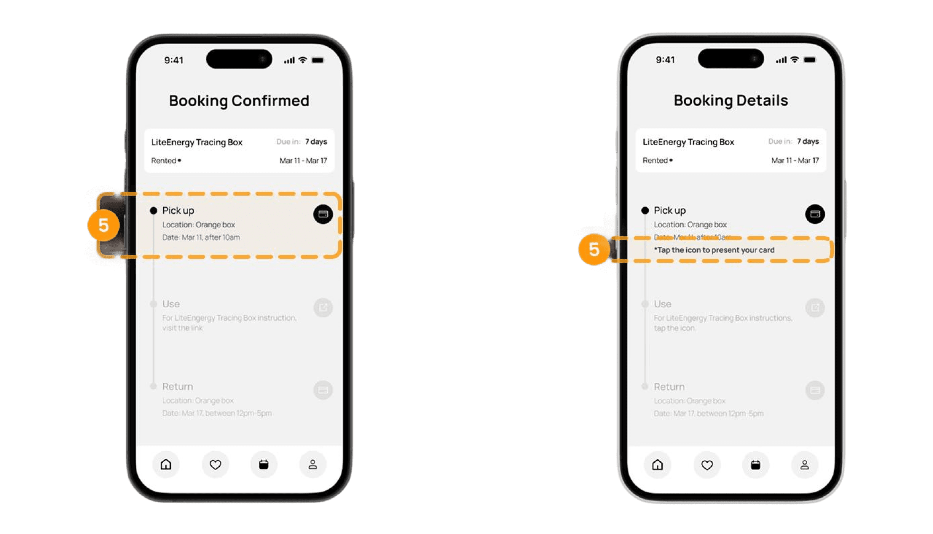
Lastly, we found that users did not realize that clicking the ‘card icon’ would open the Library Card.
To address this, we added an additional guide to indicate that the icon is interactive.
Final Result
After implementing the improvements, we finalized our wireframes, and created a Hi-Fi Mockup using assets collected from the libraries site. Which we turned into a working prototype to visualize what Alex would see through her journey. Feel free to interact with it below!