Lock Pick World
Information Architecture and Usability
Lock pick world is a one stop shop for ones lockpicking needs, my goal is to restructure their website to make it an easier flow and draw more attention to newbies getting into the field
Client
Lock pick world
Services
UI & UX Design
Industries
Ecommerce
Date
February 2025
My focus for this project was on enhancing the user experience of Lock Pick World, a website that caters to individuals interested in learning about and purchasing lock-picking tools.
The study involved extensive user research, usability testing, and iterative design improvements to address pain points and create a more seamless experience for beginners and enthusiasts alike.
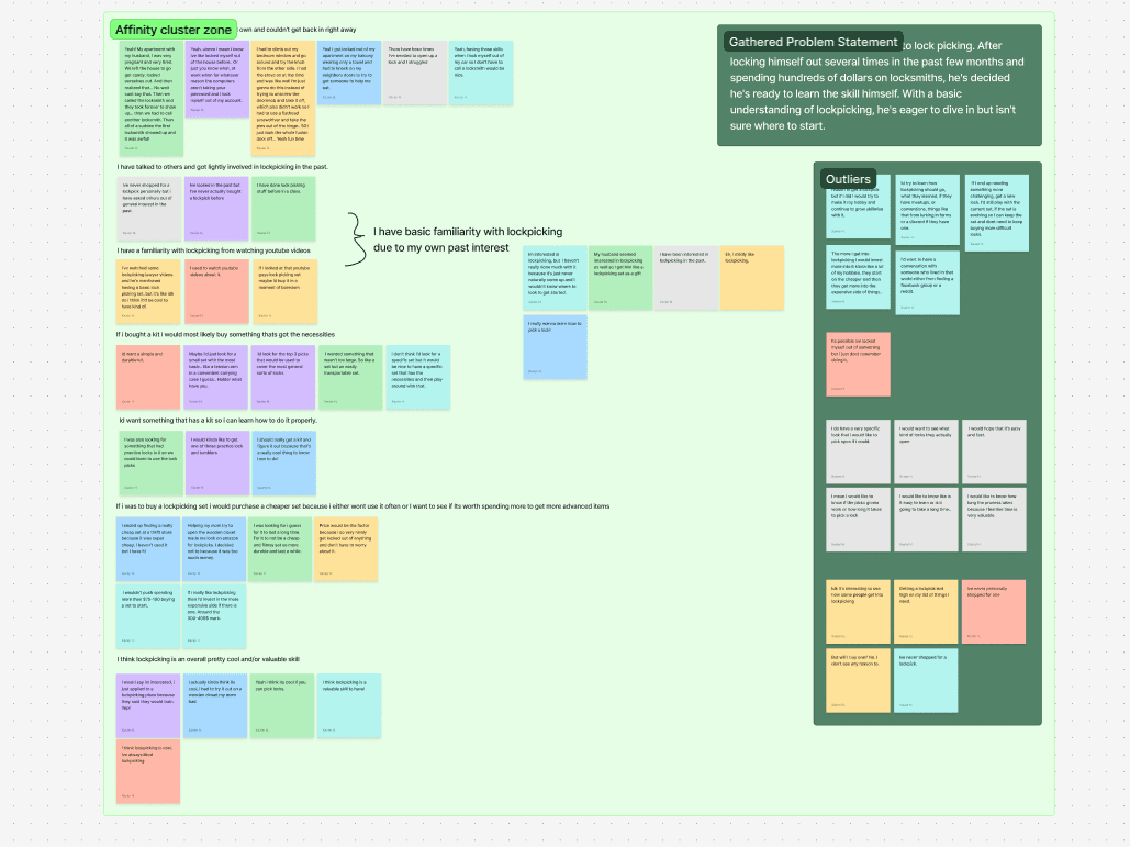
User research proved to be a challenging aspect of the project. Many interview participants had only basic familiarity with lock-picking or no experience at all. Early interviews lacked deep insights, prompting a refinement of the questioning approach. My key take aways were:
1. Reworking the interview questions led to more valuable insights.
2. Many potential users were interested in lock-picking but lacked a compelling reason to start.
3. Affinity mapping was difficult due to the diversity of individual thoughts, but common themes emerged.
My affinity mapping due to the rough early interviews was challenging. As I said , later interviews gave me more insites that I could categorize. But as you can see with the abundant outliers that I have on the side, people had a lot of things to say that didn't really have any correlation with each other.
I'm sure if I was able to get more interviews for this topic with people that are more versed in the lock picking world I would have had more advanced insites into it. HOWEVER because of this I decided to just try to spin it in a different way.
This leads to our friend (or my created persona) Mr. Bartholomew Grumplestein. (Which my mentor at the time aboslutely despised my naming convention... I think hes a pretty cool dude nevertheless).
He's the culmination of those I interviewed with more of a view which came up as a frequent talking point, those who are interested in getting into Lock picking but never pulled the trigger on it because they just haven't had a valid reason to get into it.
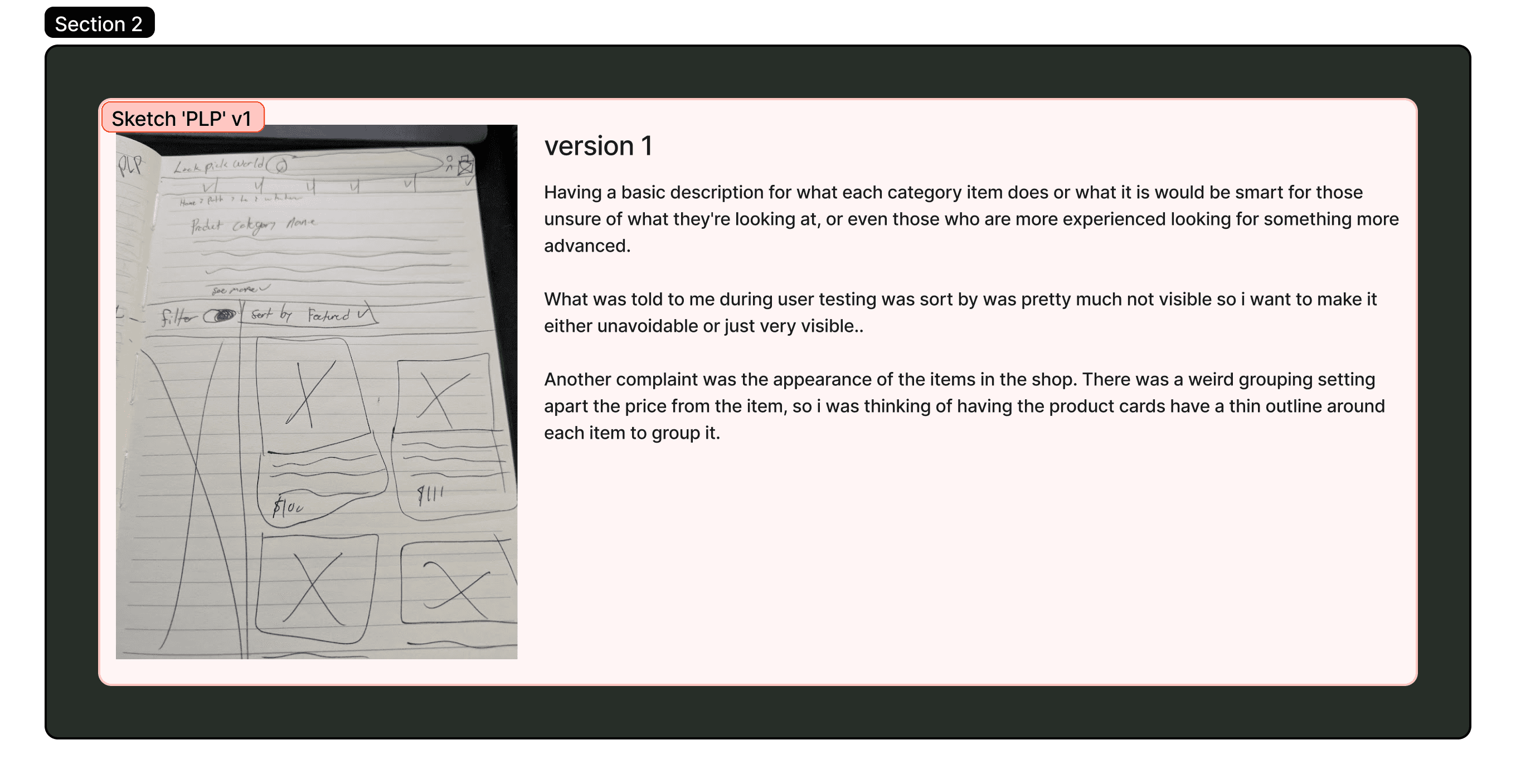
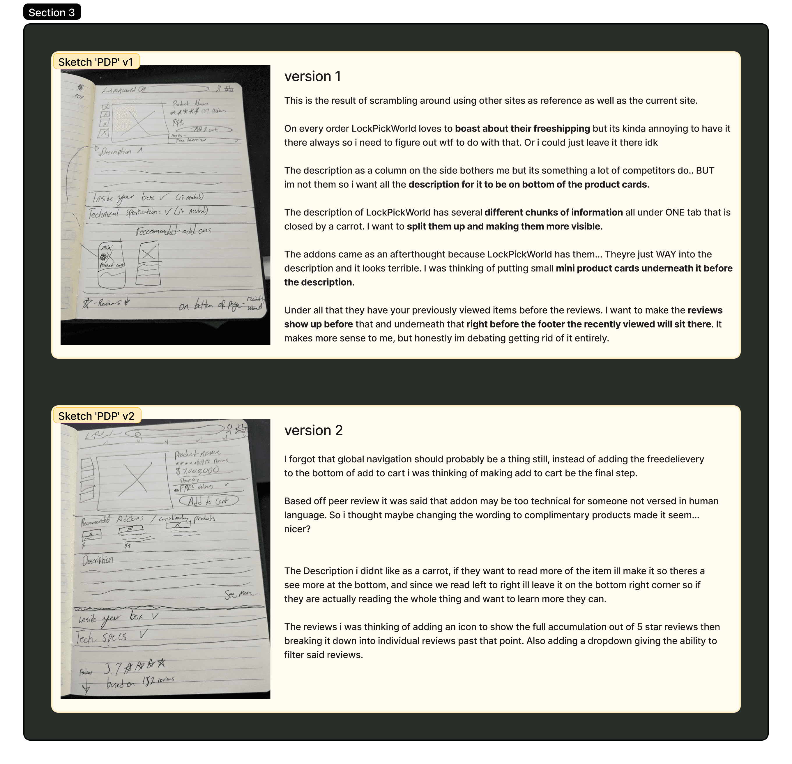
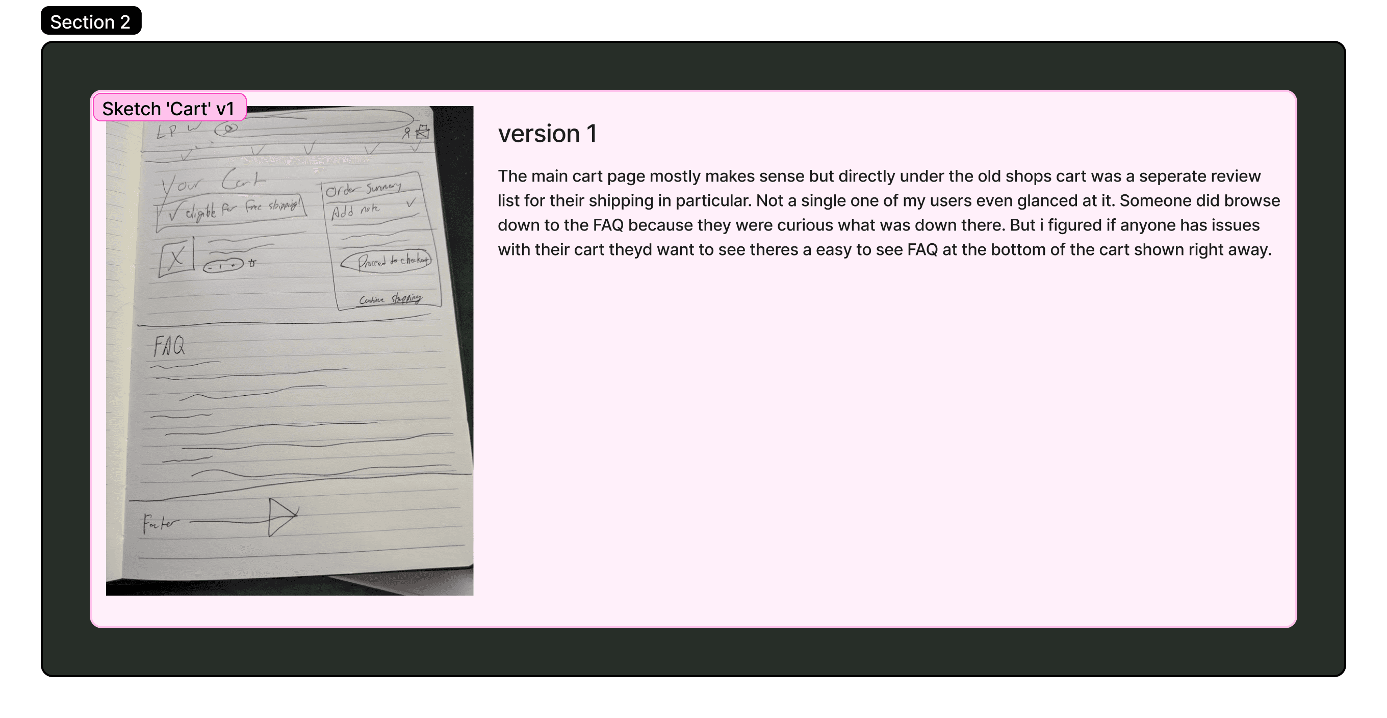
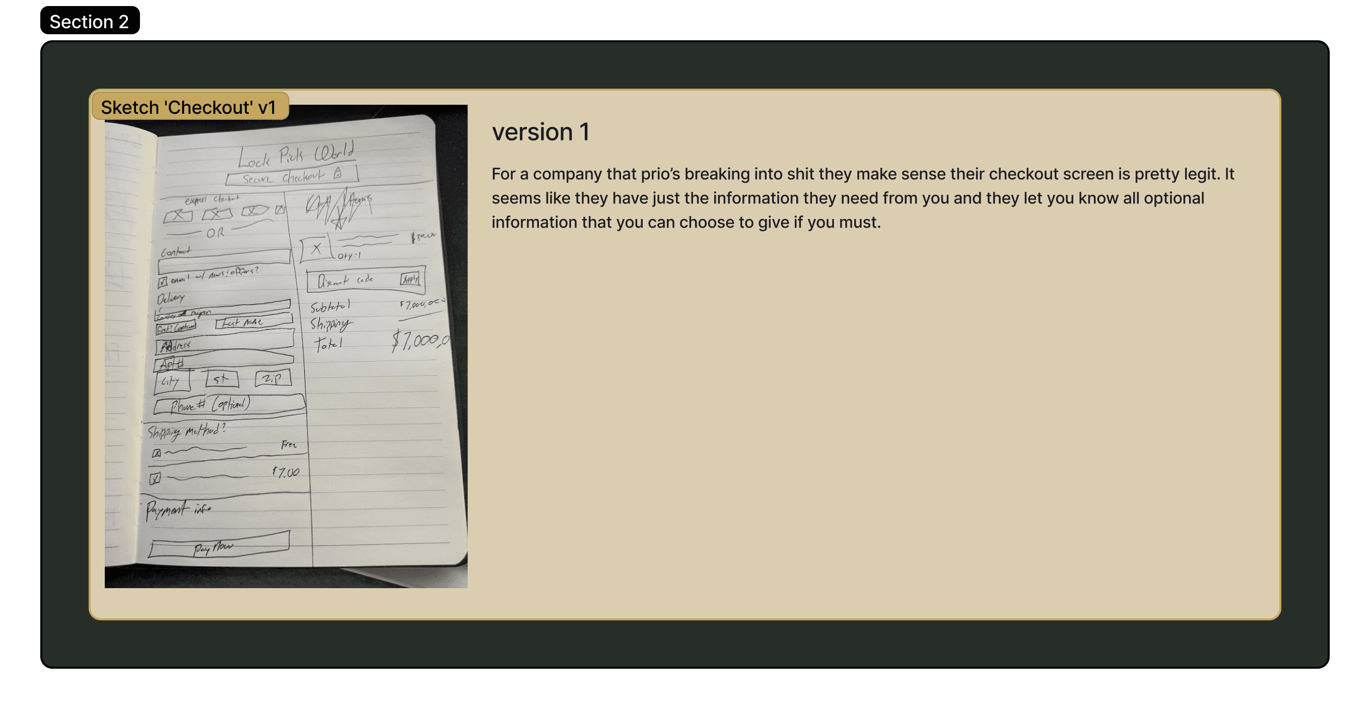
Moving on to usability testing. The site itself doesn't look atrocious as you enter it, however the more you dig and the more you interact with it you see it's true ugly head rear back from behind the curtain. The several usability tests that were performed exposed several pain points within the existing site.
Information Overload:
The site was highly informative but overwhelming, with repetitive content and essential details hidden at the bottom of pages.
Filter System Issues:
Adjusting filters caused the page to reset, leading to frustration.
Confusing Pricing Layout:
Users found it difficult to identify which prices corresponded to which items.
Unclear Product Listings:
The Product Listing Page (PLP) lacked clear indications of stock availability, and some links didn’t lead to proper Product Detail Pages (PDPs).
Clunky Cart & Checkout:
Users were distracted by redundant information.
Another issue that I noticed was that a lot of the dropdowns on the site had a lot of out of place or categories that seemed to only make sense to those who are aware of what name brands are for lockpicking.
I found some willing users and had them sort a the same number of items pulled from the shop, they were randomly screenshot and placed inside of a card sort for them to well.. sort.
Once the sort was finished and my users set loose to wander whatever field they came from, I saw a pattern appear from their work, which allowed me to create a sitemap… well actually 3 sitemapes.
As I went with future iterations I began to understand what I should be looking for, so I expanded it further. My second sitemap begged the question 'Do all of these broken out make sense, and also what the heck should I do with their blogs?' They had a ton of useful information in them but as they were laid out on the main site it wasn't accessible. So I thought of the solution to put it in a Sub Nav and I made a note to try and find a way to make it more accessible and bring attention to it so that Bartholomew could find it.
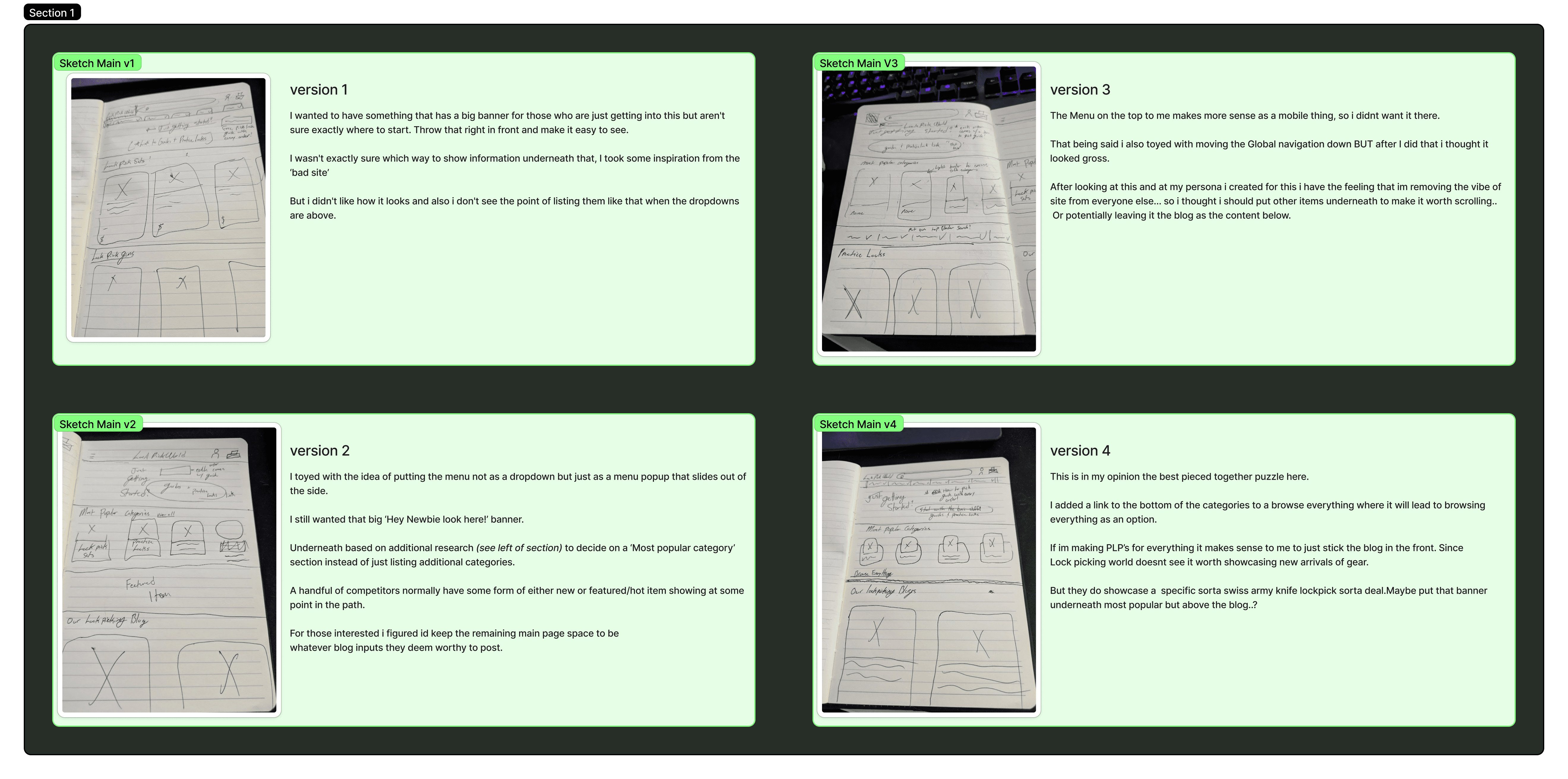
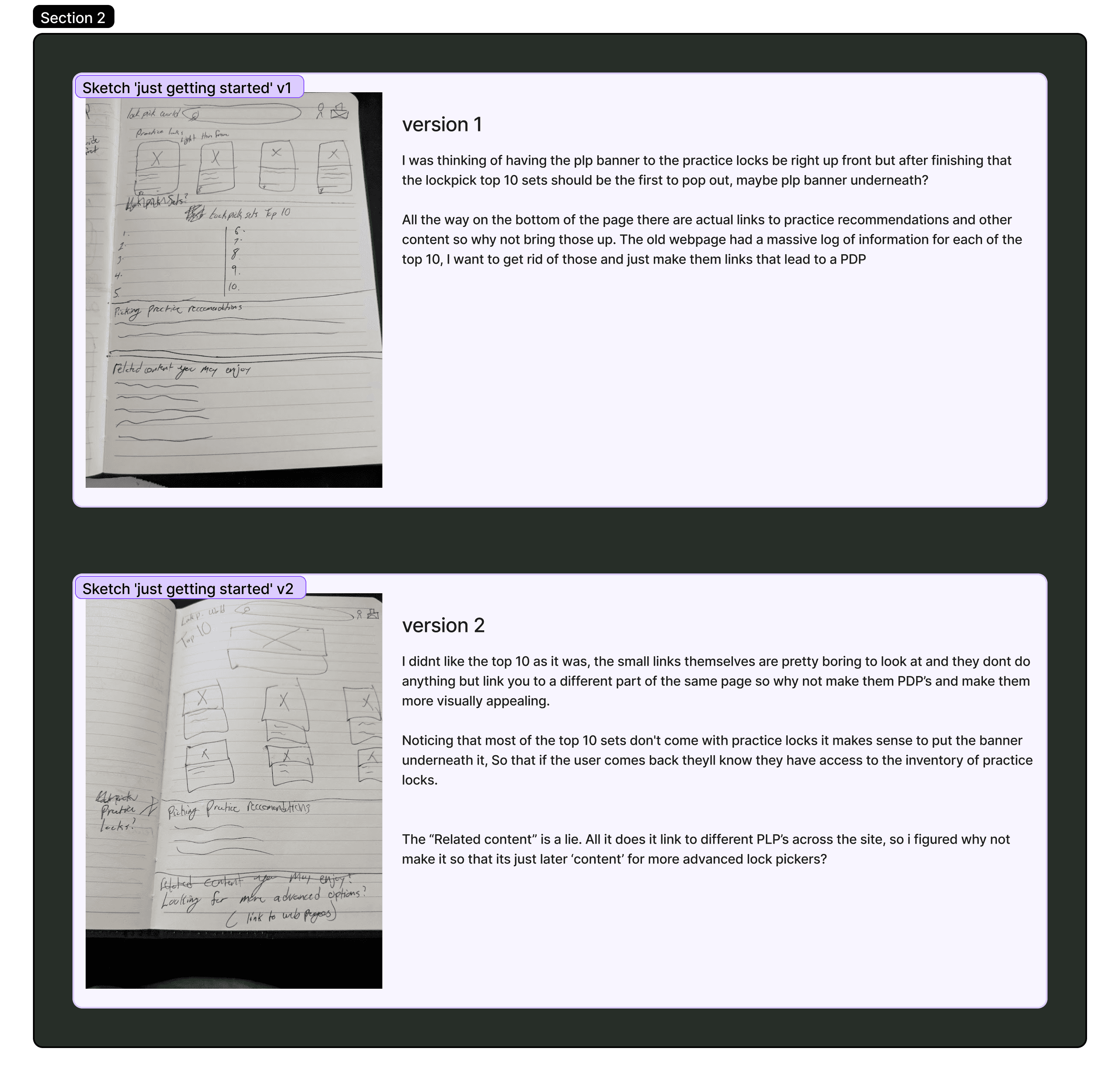
Based on my user research, I aimed to create a more welcoming experience for newcomers by featuring a prominent top banner with a direct link to a Product Listing Page (PLP) showcasing the top 10 recommendations. The original site attempted this, but its unclear wording and unusual guide presentation for beginners only added to the confusion. As I developed my sketches, I frequently revisited insights from Mr. Grumplestein and my user research to steer the design back on course. In the end, I shifted the page’s focus to the blog, which hides a wealth of resources and articles for users who want to explore further.